Tips for Choosing Calm Colors to Transform Your Home
Creating a calm and relaxing environment in your home starts with choosing the right colors. Colors influence our mood and energy, so selecting calm, soothing tones can help turn your living spaces into peaceful retreats. Whether you’re redecorating an entire room or just adding subtle touches, these tips will guide you in choosing colors that promote tranquility and comfort.
Why Choose Calm Colors?
Calm colors help reduce stress and create a welcoming atmosphere. They can improve focus, restfulness, and even sleep quality. When your home feels peaceful, it becomes easier to unwind after a busy day.
Common calm colors include soft blues, gentle greens, muted neutrals, and warm pastels. These shades often mimic natural elements like the sky, sea, and earth, which our brains interpret as soothing.
Consider the Purpose of Each Room
Different rooms serve different purposes, so it’s important to pick colors that match the function of the space:
– Bedrooms: Soft blues, light greens, and lavender are excellent choices for promoting rest and relaxation.
– Living Rooms: Warm neutrals, soft grays, or muted blues can create a cozy and inviting social space.
– Bathrooms: Clean, pale colors like seafoam green or light aqua evoke freshness and calm.
– Home Offices: Soft earthy tones help maintain focus without feeling too distracting or sterile.
– Kitchens: Gentle yellows or light beige can bring warmth while keeping energy calm and balanced.
Understand Color Psychology
Colors affect emotions in subtle yet powerful ways. Here’s a quick guide to some calming colors:
– Blue: Often linked with tranquility and peace; it lowers blood pressure and slows breathing.
– Green: Symbolizes nature and renewal; it’s calming and refreshing.
– Lavender and Soft Purple: Associated with relaxation and spirituality.
– Soft Neutrals (Beige, Taupe, Soft Gray): Provide a stable, grounding effect without overwhelming the senses.
– Pastel Pinks and Peach: Gentle and comforting, ideal for cozy areas.
Avoid overly bright or intense shades if your goal is calmness, as these can increase energy and restlessness.
Test Colors with Light
Natural and artificial lighting can change how colors appear in your home. Always test paint samples on your walls before committing:
- Paint small patches on different walls.
- Observe the color during various times of day (morning, afternoon, night).
- Notice how shadows and lighting affect the tone and mood.
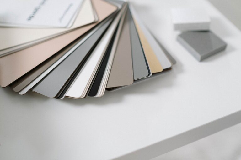
Sometimes a color that looks calming in a store sample card can feel too dull or too bright in your space.
Use Color Combinations Thoughtfully
Pairing colors can enhance calmness when done correctly:
– Combine cool colors like blue and green for a harmonious effect.
– Use a neutral base such as soft gray or beige and add accents in pastel shades.
– Limit contrasting colors in calm spaces, as high contrast can feel energetic.
– Consider monochromatic schemes where one color varies in shade and tone for subtle variation without tension.
Incorporate Texture and Accent Colors
Calm colors don’t have to be boring. Use texture to add interest without overwhelming the senses. Examples include:
– Soft textiles like curtains, rugs, and cushions in calming shades.
– Matte or satin paint finishes that reduce glare.
– Natural materials like wood, stone, or woven baskets complement calming colors beautifully.
Accent colors can introduce personality. Choose muted versions of your main color palette rather than bright, bold hues to maintain a peaceful vibe.
Think Beyond Paint: Calm Colors in Decor
Painting walls isn’t the only option. You can introduce calmness through:
– Furniture in light, natural wood tones.
– Artwork featuring soft landscapes or abstract designs in soothing colors.
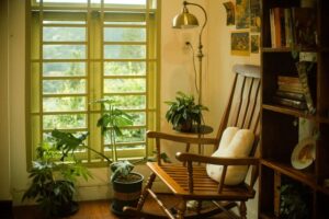
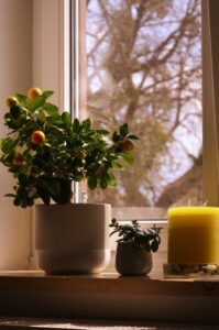
– Plants with lush green leaves to bring nature indoors.
– Lighting with warm white bulbs to create a cozy atmosphere.
These elements work together to support the calming color scheme.
Maintain Balance and Simplicity
Too many competing colors or patterns can disrupt calmness. Aim for balance by:
– Limiting your color palette to 2-3 main colors.
– Keeping décor simple and uncluttered.
– Using open space wisely to avoid overcrowding.
A minimalist approach paired with calm colors often results in the most restful environments.
Final Thoughts
Choosing calm colors for your home is a creative and personal process. By considering the function of each room, understanding color psychology, testing colors with lighting, and combining hues thoughtfully, you can design spaces that bring peace and relaxation. Remember, calm doesn’t mean dull—it means creating a harmonious and soothing atmosphere where you can truly feel at ease.
With these tips, your home can become your favorite peaceful retreat. Happy decorating!